Magyar Kultúra is a monthly cultural magazine, now in its fourth year. Each issue focuses on a particular theme, exploring its different aspects. Articles on the theme are published in science, humanities, and arts. On the fourth anniversary of the magazine's launch, the editorial team felt it was time to modernize the image. I was given the task of redesigning the magazine from the inside out.
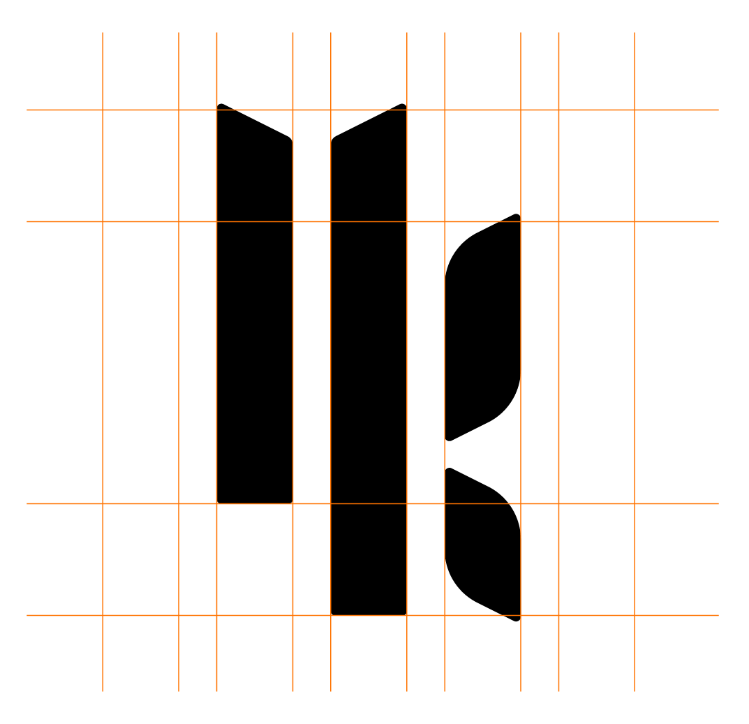
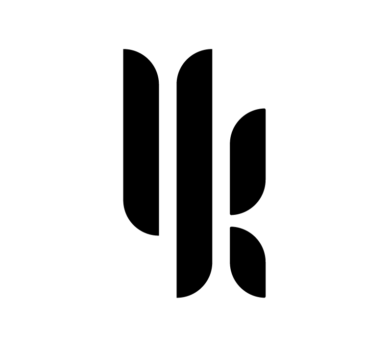
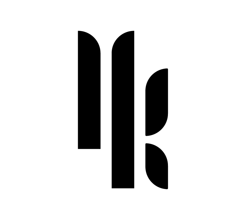
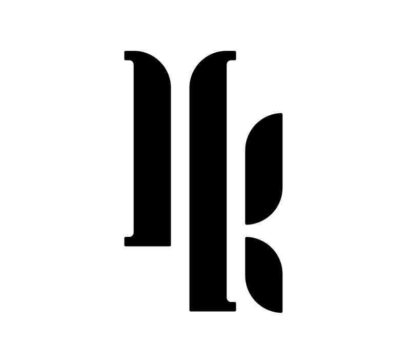
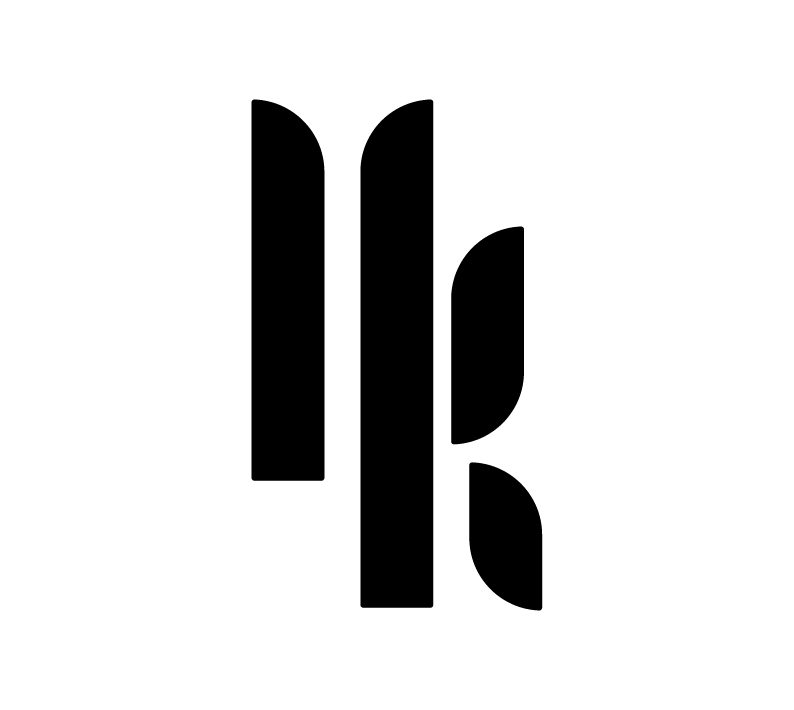
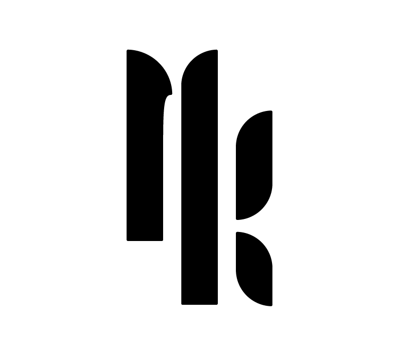
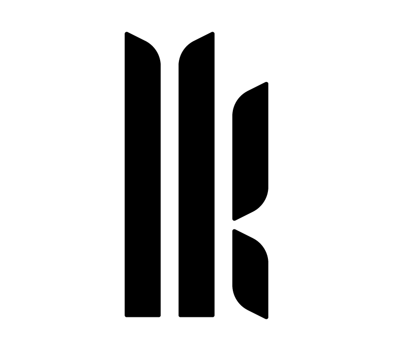
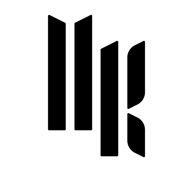
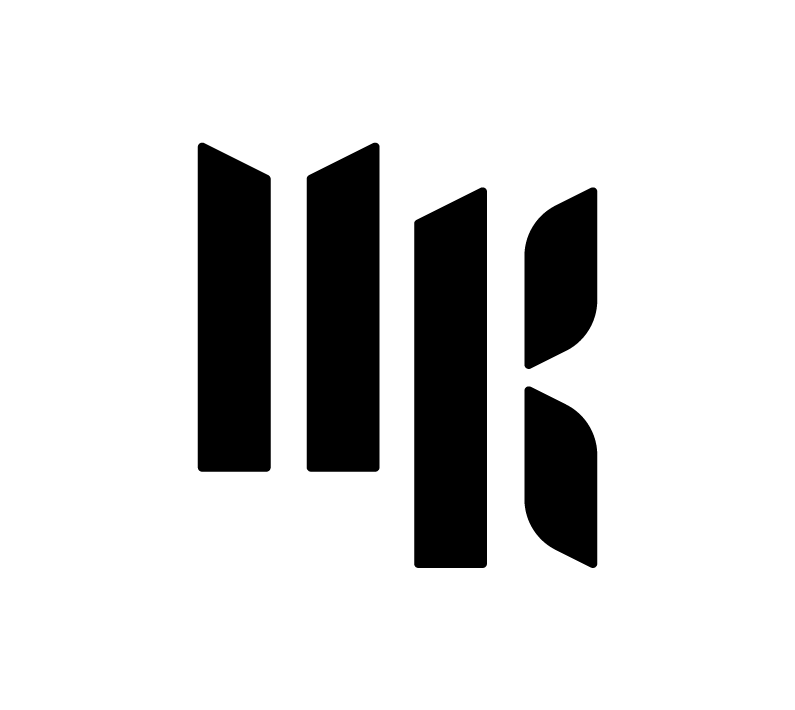
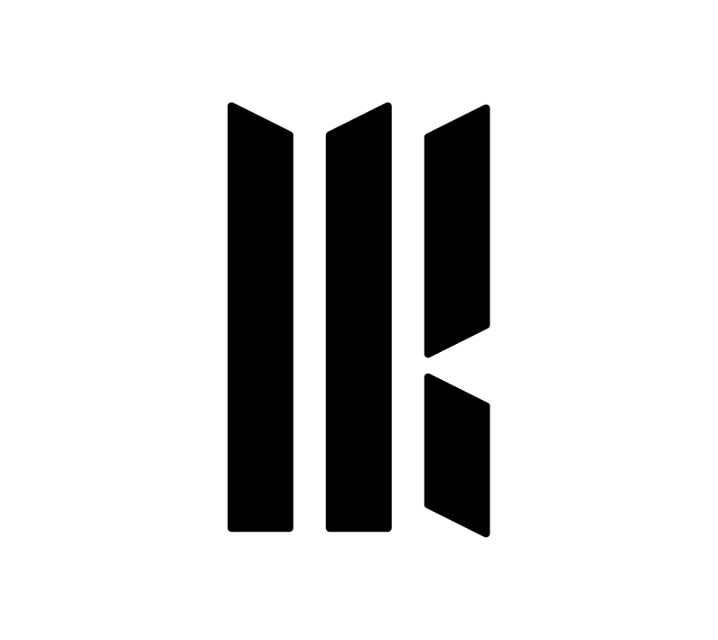
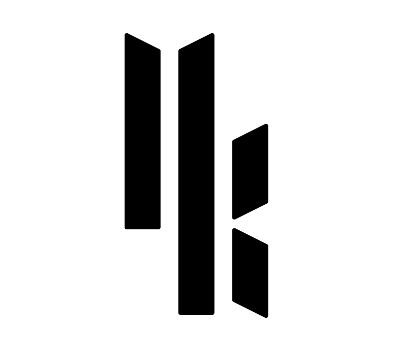
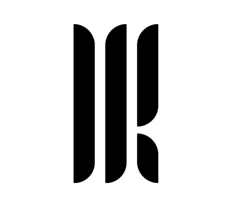
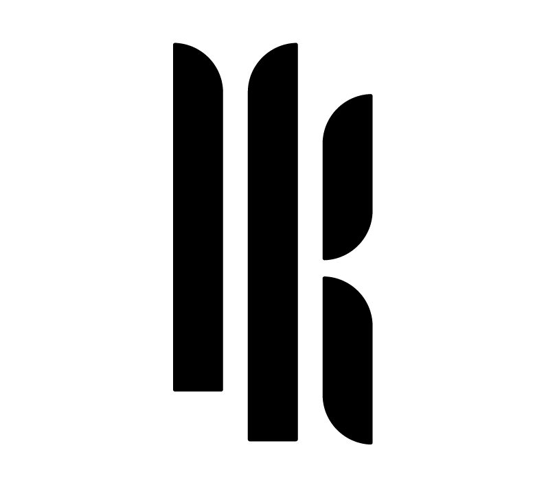
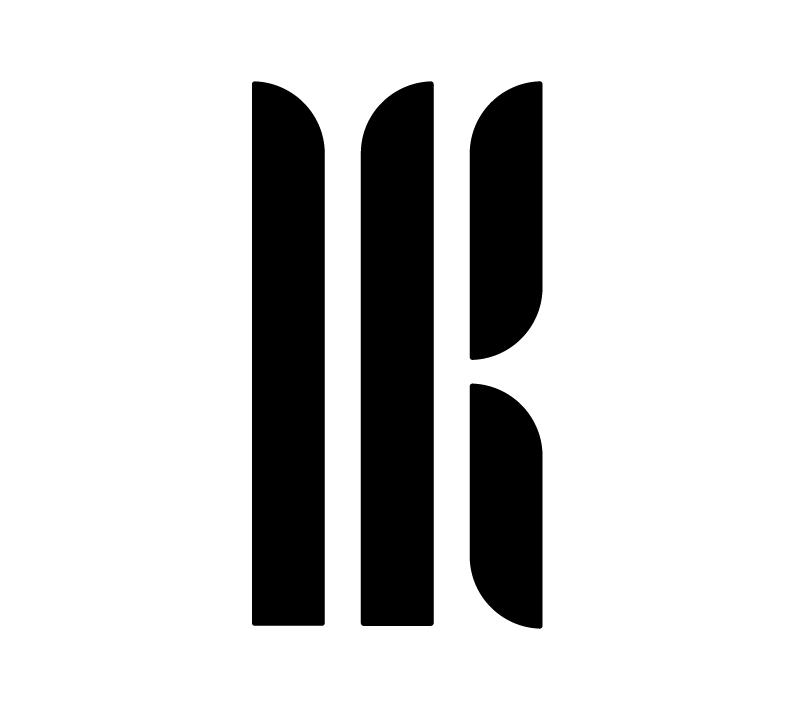
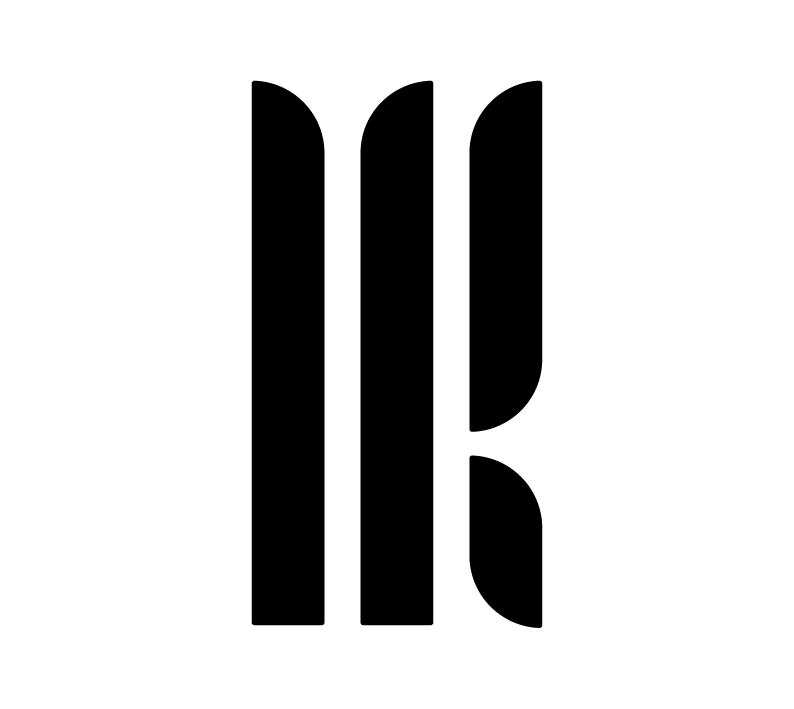
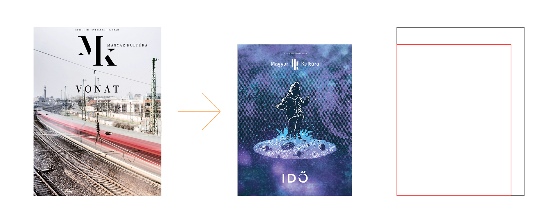
The first element I've redesigned was the logo. My goal was to make a simpler logo, which, apart from being different, is also somewhat related to the previous logo.
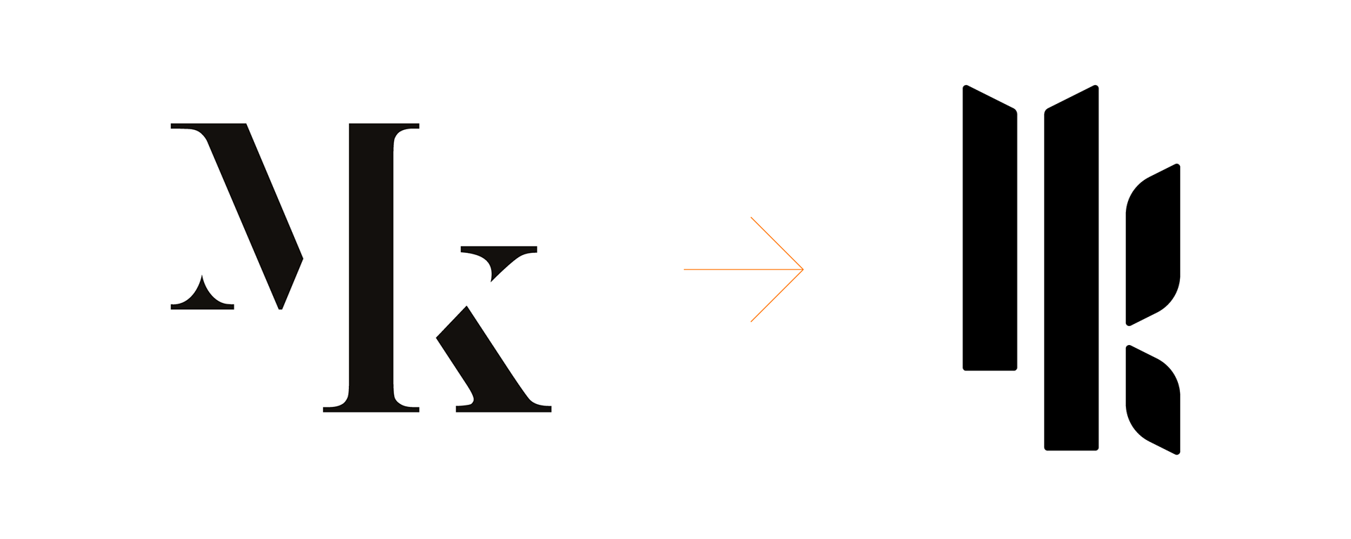
For this design, I've used Roch Modrzejewski / ROHH's "Gigafly Headline Demi Bold" font. The intention was to create a look that was elegant, friendly and a bit unusual.
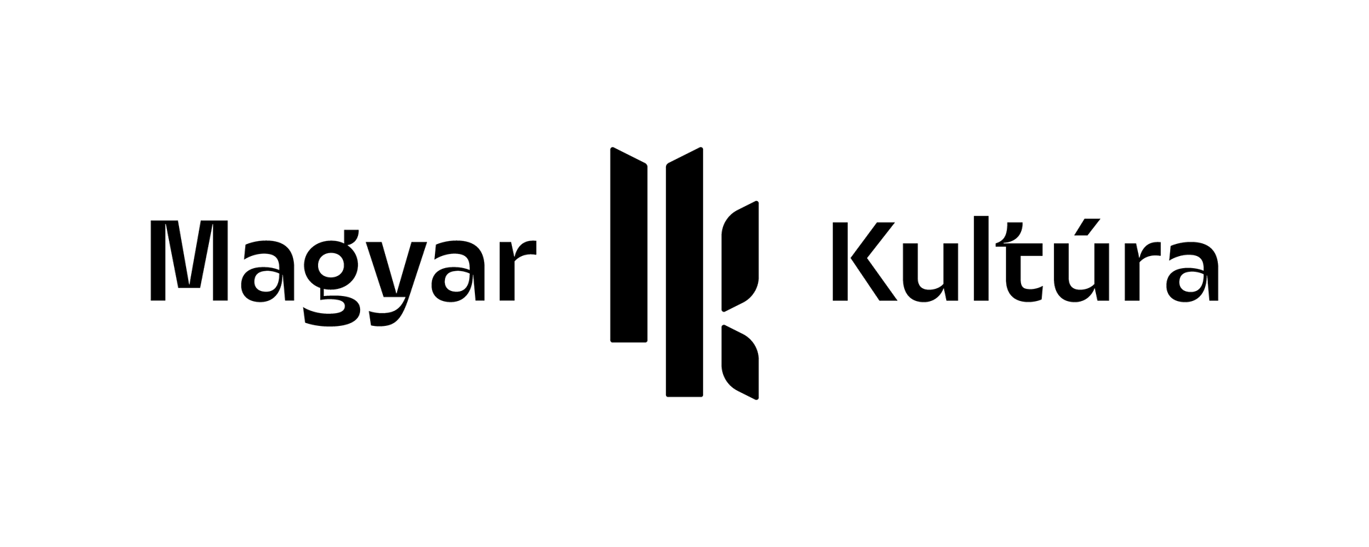
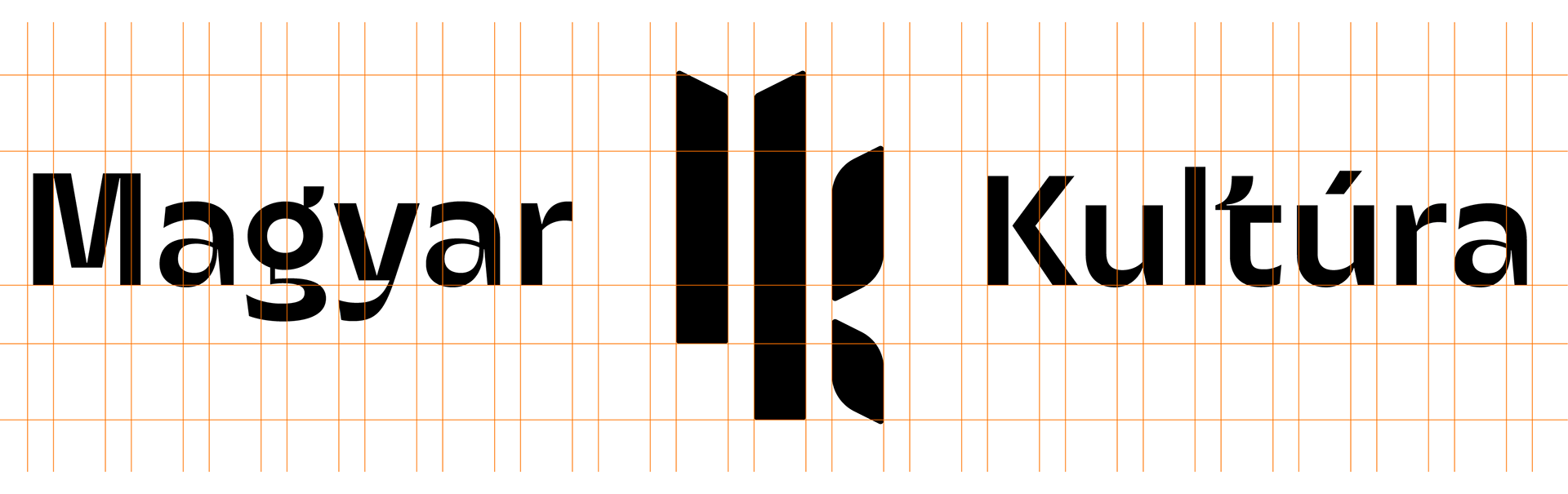
Of course, we looked at a lot of logo variations. It had to be clear, readable, but not too wordy.


Then, we decided to make the newspaper smaller than before. We reduced the size from A4 (210 x 295 mm) to a much more reader-friendly size (200 x 260 mm). The reduction not only improved usability but also shifted the feel of the magazine in the desired friendlier direction.
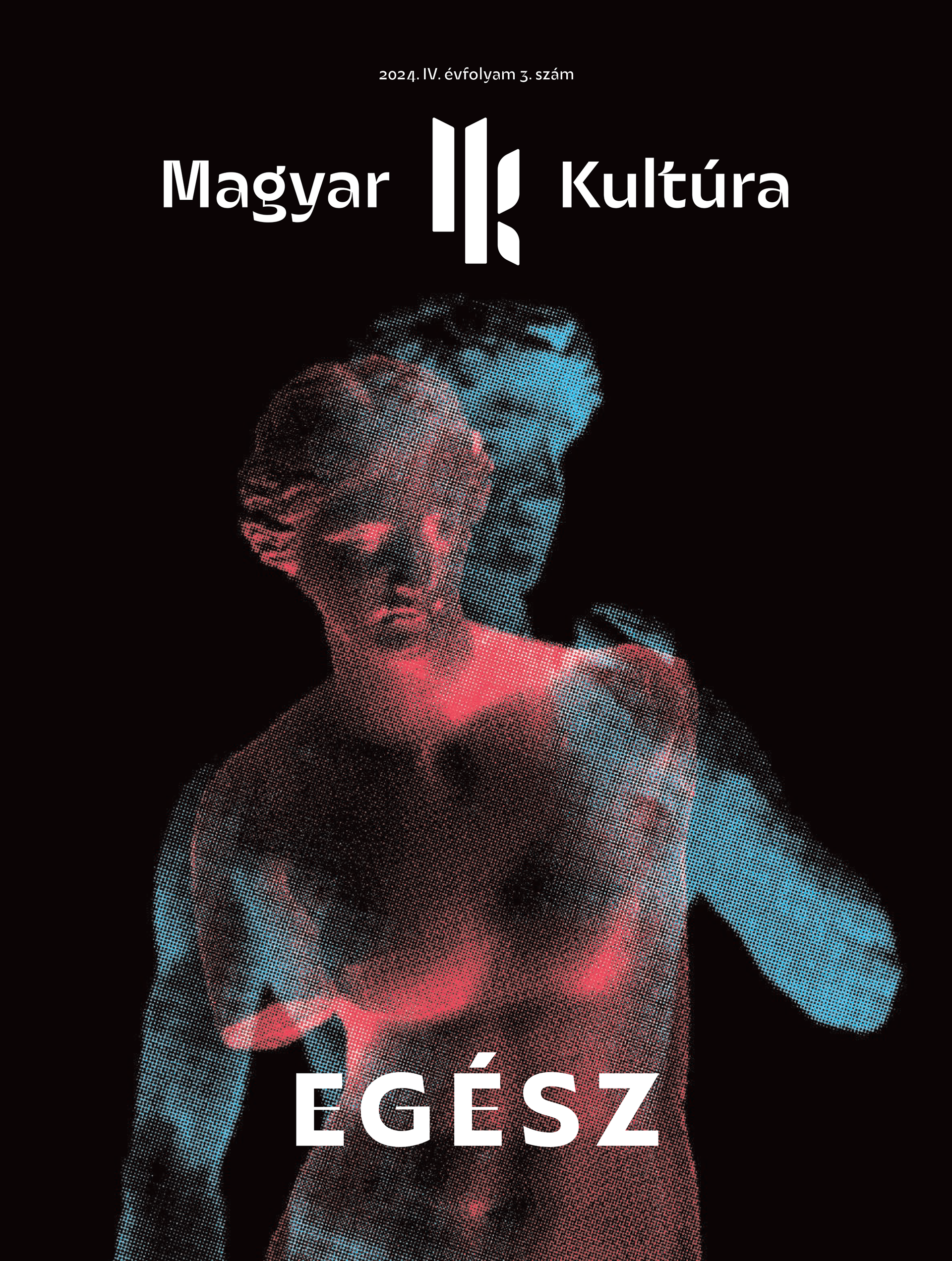
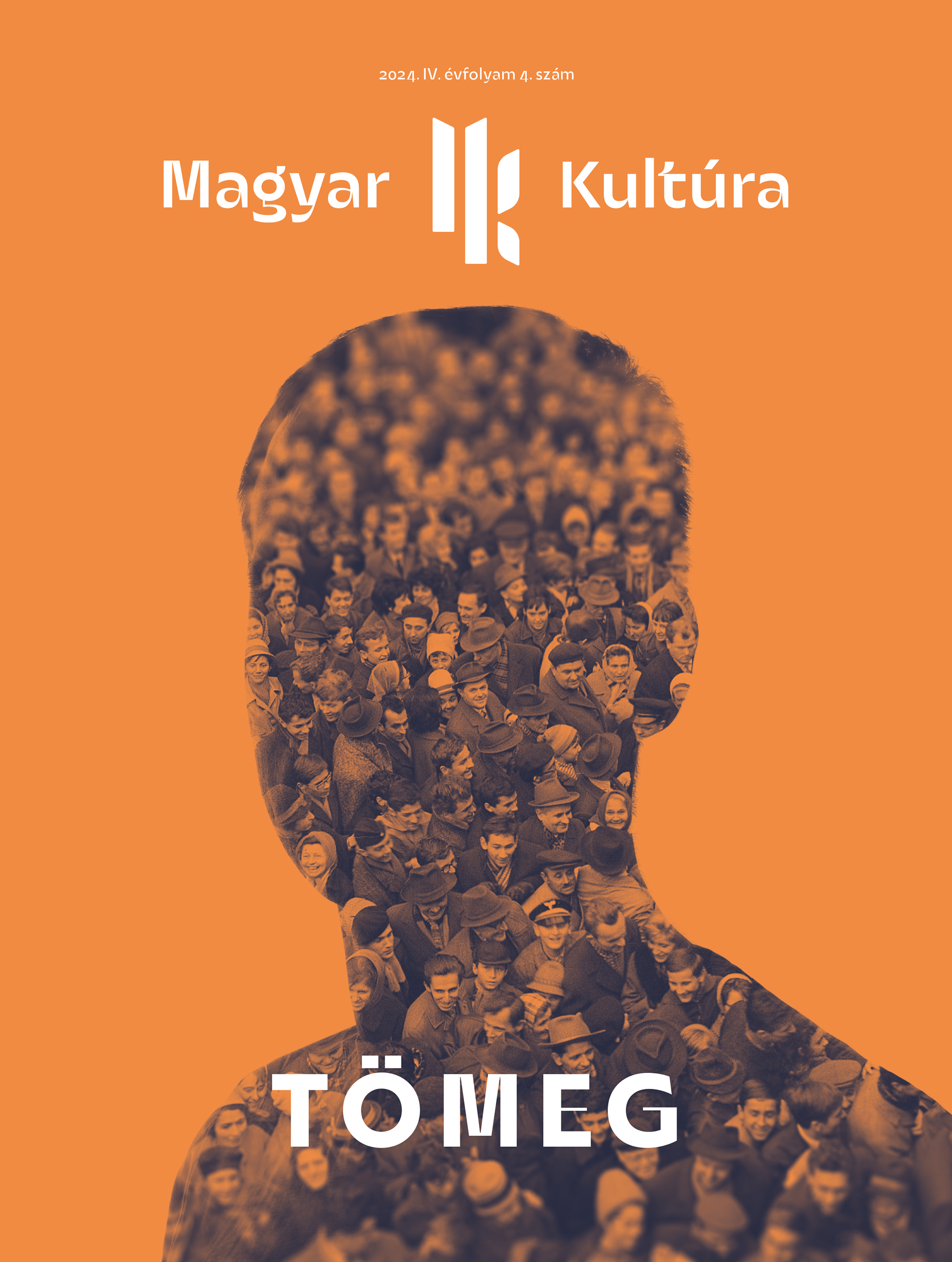
I use a different color palette for each issue. The colors are determined by the theme of the issue and the photos used. I was looking for bright, vibrant colors that work well on dark and white backgrounds.
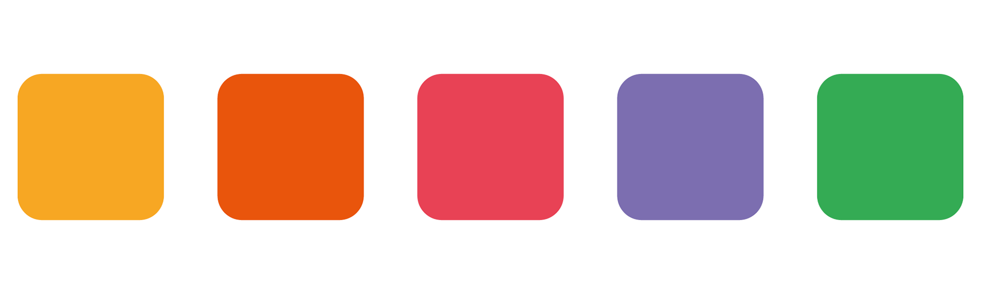
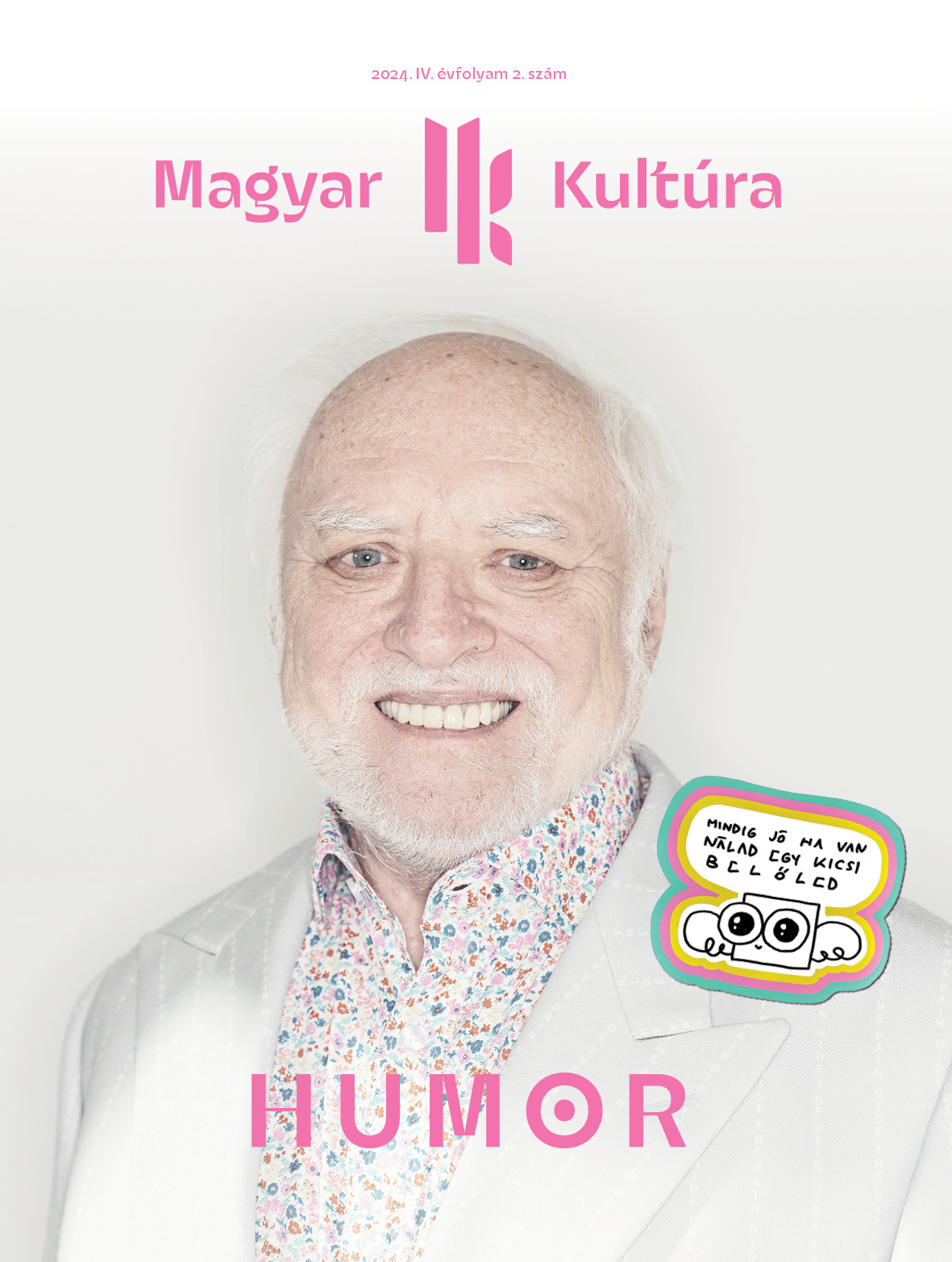
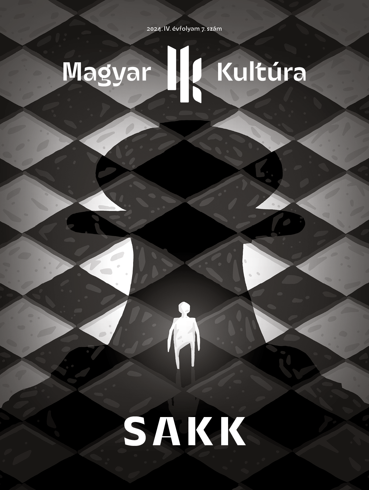
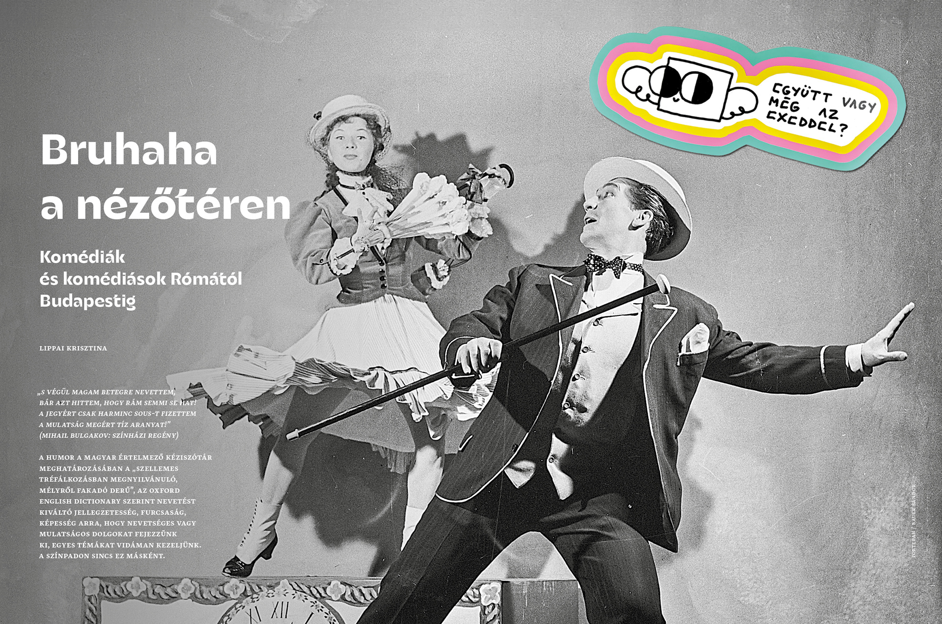
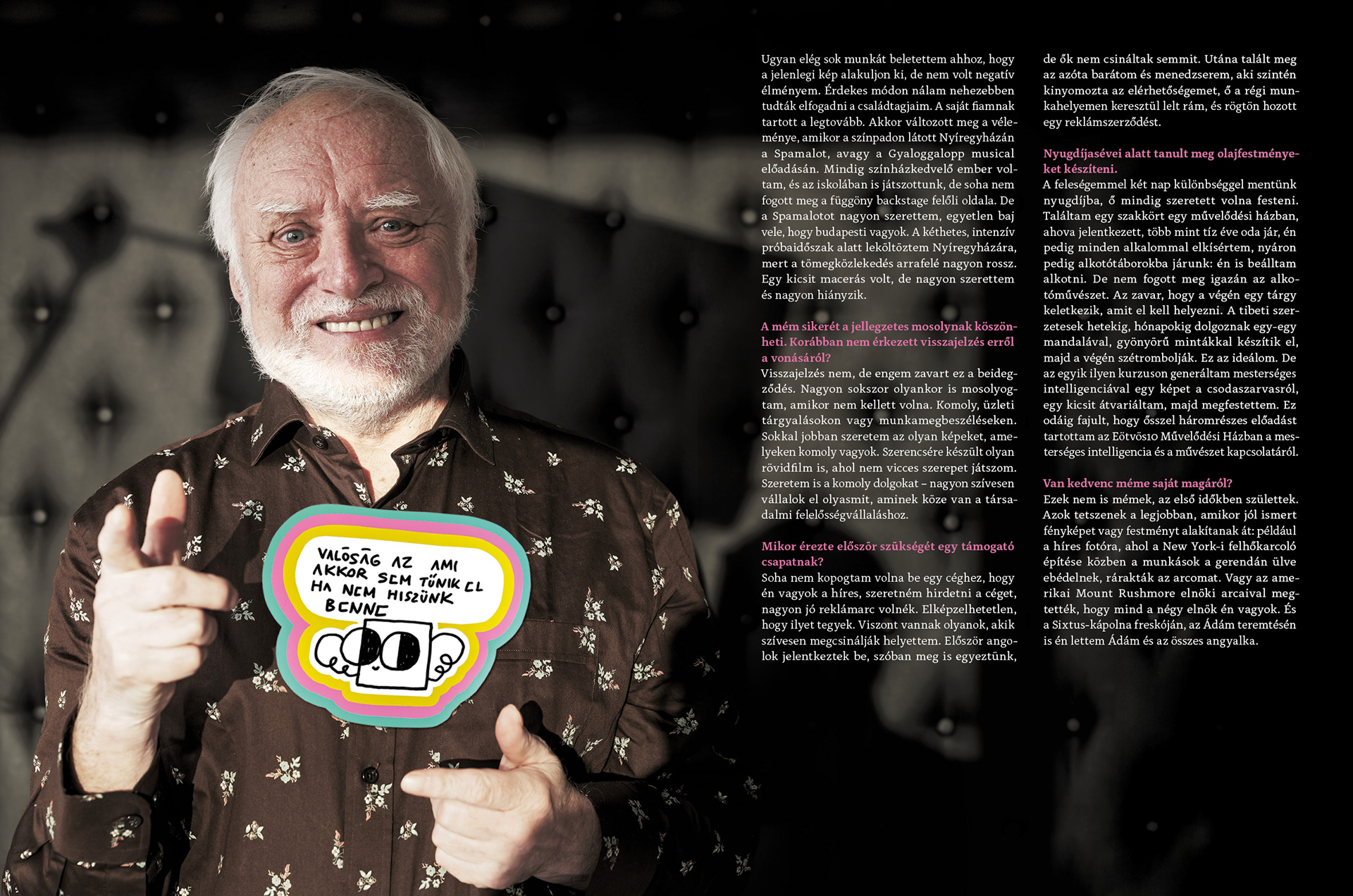
These colors determined the dominant color for each issue! Every cover is made by me, except for the "Humour" issue, where we used a photo cover with Hide the Pain Herold and Box With Wings. It's a huge pleasure to have the editorial team as partners in having hand-drawn covers!
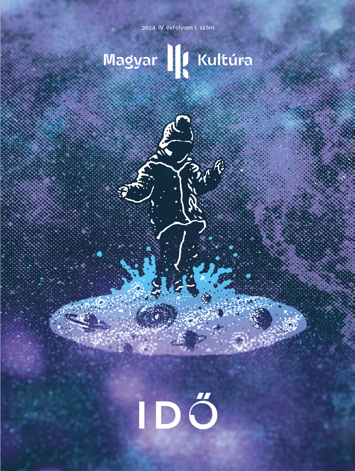
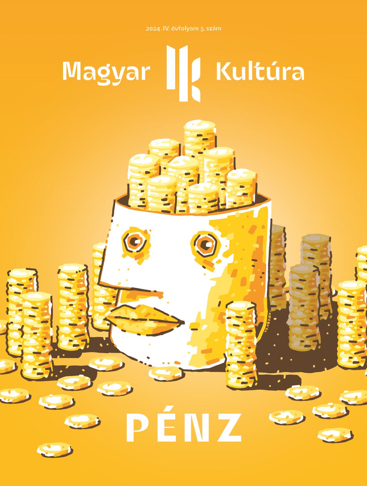
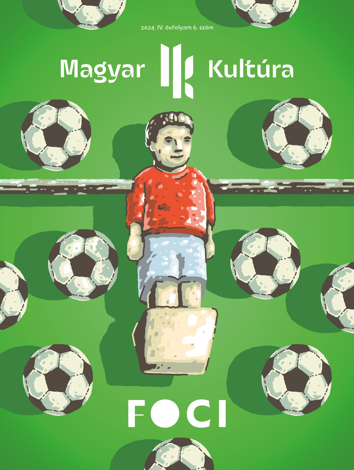
Often there are several sketches, from which we choose the one that will be on the cover - in fact, in the case of the Football issue, I drew two final covers!
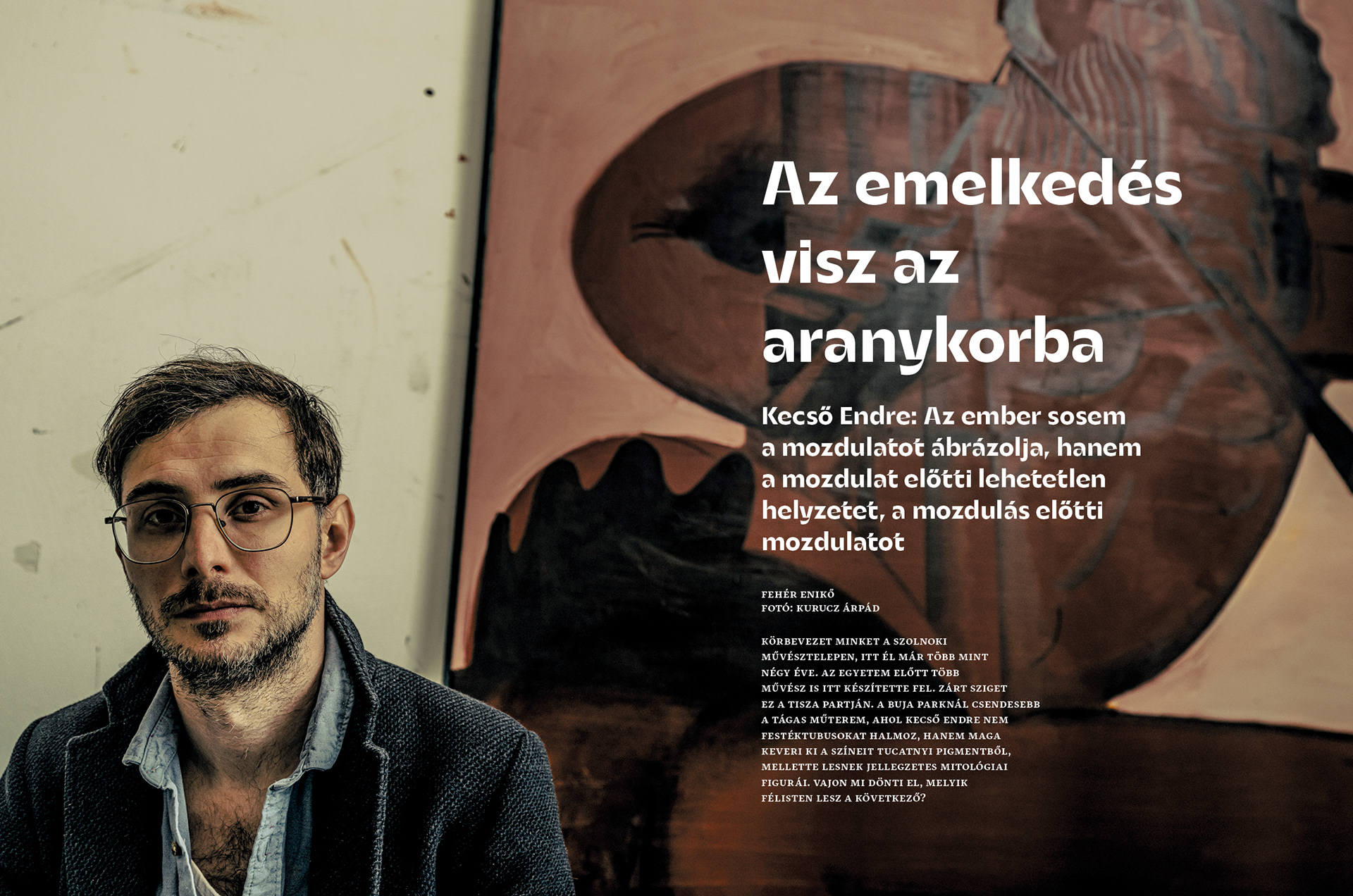
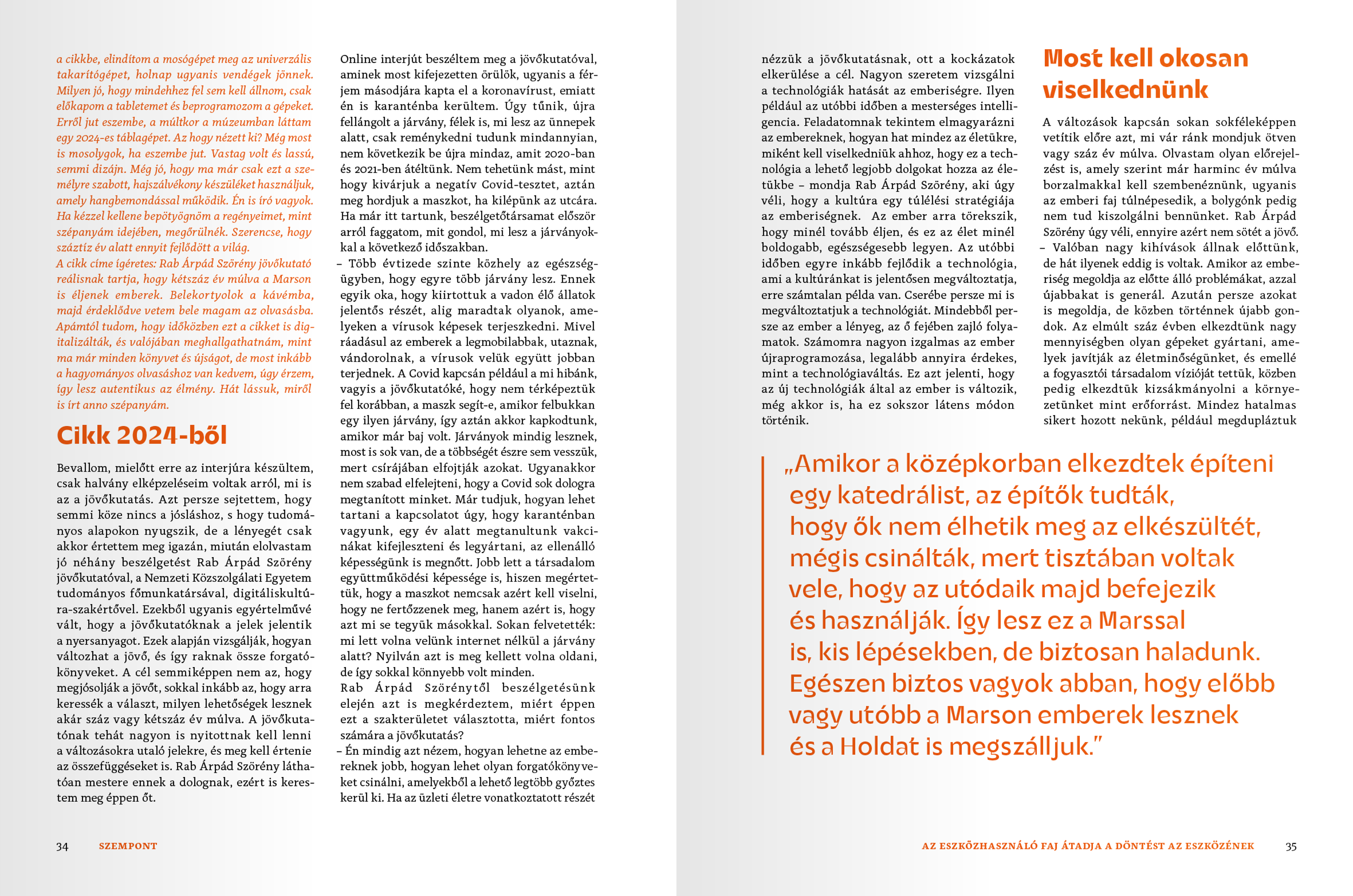
Next, I redesigned the layout. I tried to keep the good qualities of the previous design and only changed what I felt was justified. So the two columns were retained with two-page images to start the chapters.
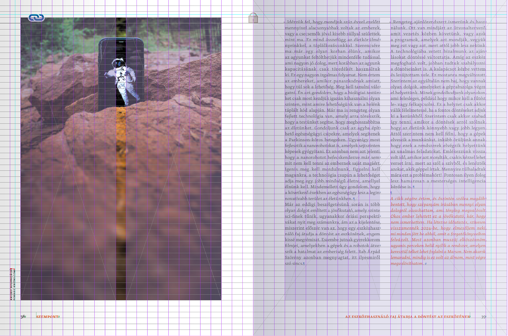
As much as possible, I wanted to use large images in the page, which only go beyond the margin when justified. I wanted to avoid a stifling, overly crowded rhythm. For all articles, I use double-page spreads to separate them from the main text.
For the texts I used Fontfabric studio's font "Alkes", which is a great typeface that is easy to read even in small sizes.
For the highlighted quotes I used "Gigafly Headline Regular".
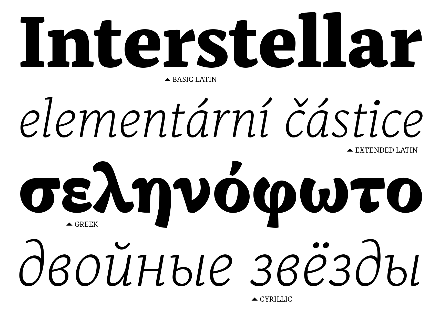
Alkes
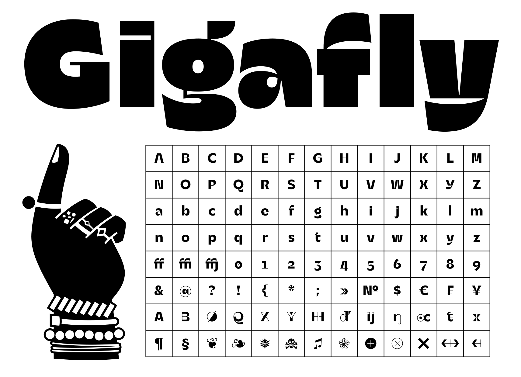
Gigafly
Where the subject matter and available images allowed, I also used double-sided compositions.
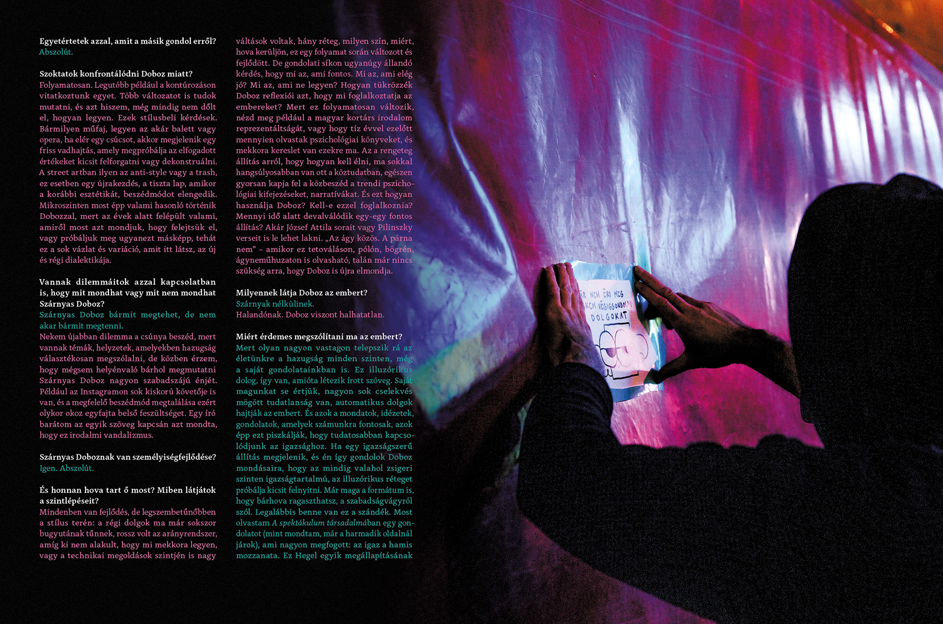
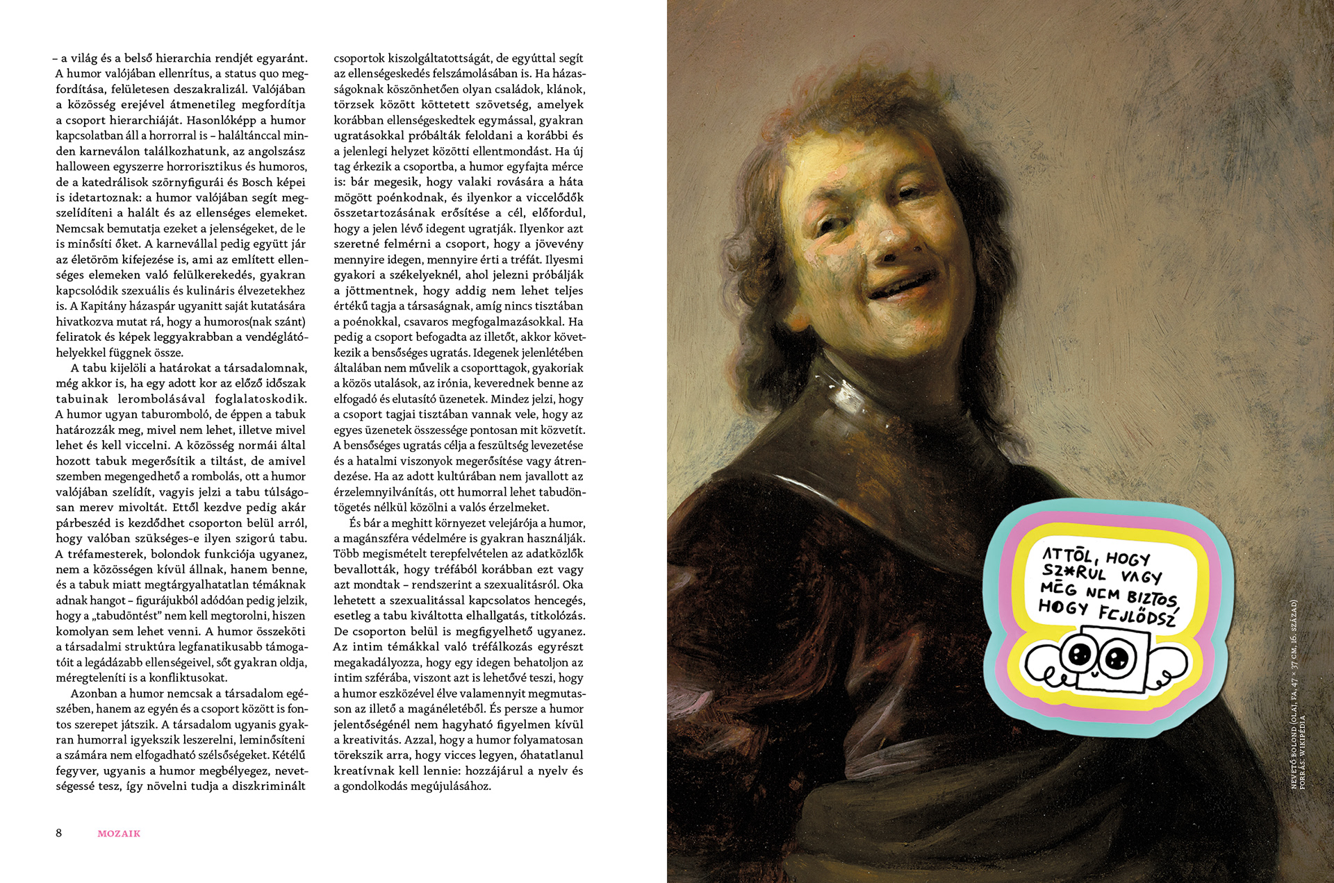
Occasionally, if the theme allows, we experiment with more fun stuff! In the case of the "Humour" issue, for example, we interviewed Box With Wing (instagram.com/boxwithwings) and asked him to "glue" the paper full of stickers specially made for the issue - which appeared in the most unexpected places in the paper!
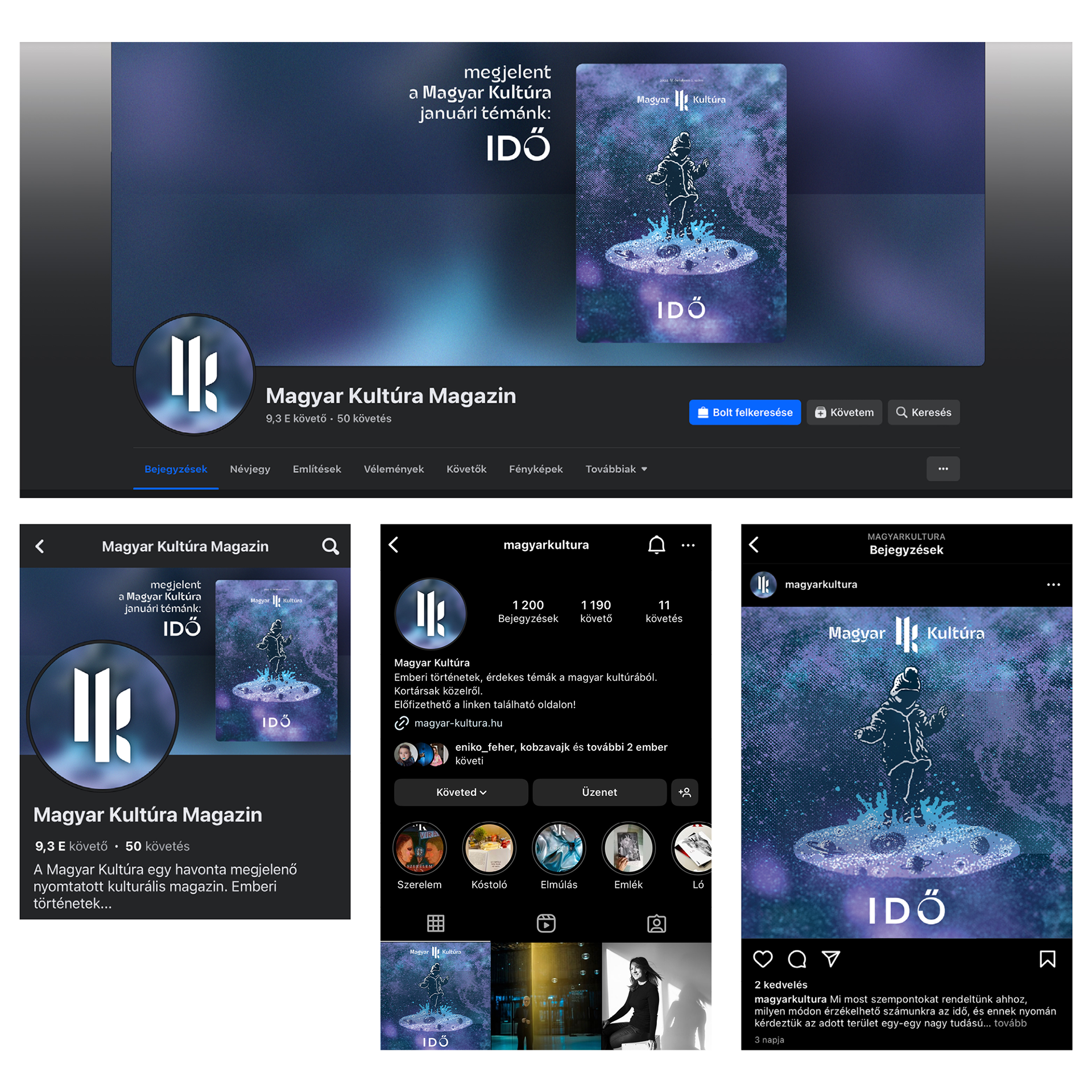
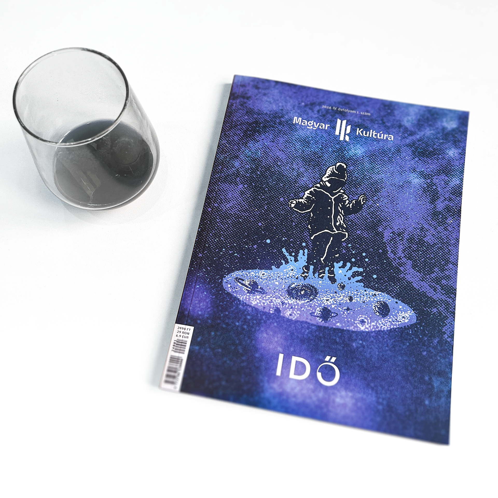
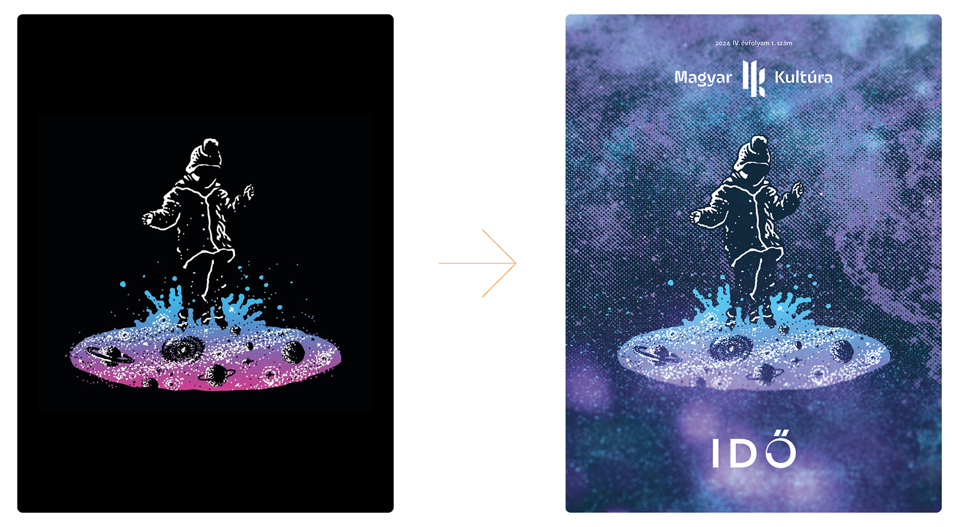
The first issue I worked from is the theme "Time". You can read about the radically different approaches of geneticists, astronomers and meteorologists. For the cover, I used a heavily modified version of an earlier graphic I had created and adapted to the magazine.
Each issue's social media presence has been given a visual theme related to the current cover.